St. Clare's Parish Center
Early Childhood Development Center
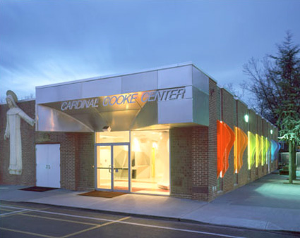
150 Nelson Ave, Staten Island, NY
Context
A complex of design strategies configures the solution for the St. Clare Preschool. The intent was to establish a sense of openness and freeplay for a program involving the guidance and education of young children. The proposed architecture endeavors to mediate the imposition of authority over developing youth by calling into question the role that architecture plays in structuring a learning environment. The site of the renovation is within an existing and highly active gymnasium on a church campus. The preschool is situated adjacent to the gymnasium within the same structure.
Strategy
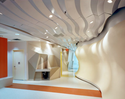
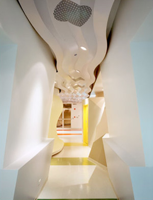
The use of merely vertical walls was called into question and instead All surfaces are "activated." All vertical elements in the project are designed to engage and facilitate function and use in the project. Instead of walls merely dividing space, the activated surfaces in this project absorbed function (shelving and storage as well as human geometry). These hyper-surfaces also offered function (display zones and other interpretive surfaces). Further, the entire space was comprised of two horizons: one at 3'-6" for the (developing) youths and the other at normal head height for adult (guardians).
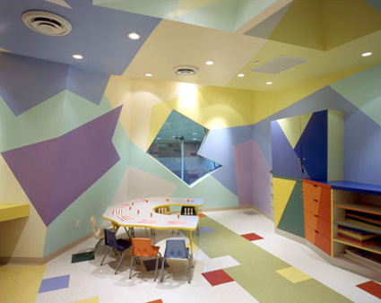
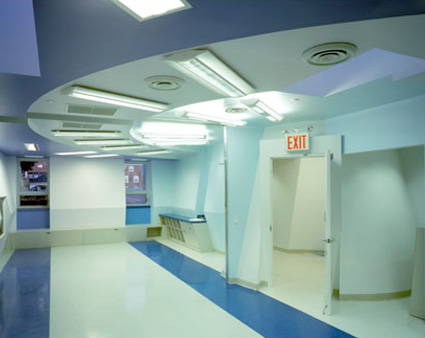
There are two major zones in the space establishing dialectic between the general categories: "secular" and the transcendent/abstract. The first zone originates at the front door and ends at the opening of the gallery hallway. This secular zone is an area codified by the warm colors bands imbedded in the floor design (from red to yellow). This zone denotes bodily and tactile sensory experience. The curvature of the lobby wall and the fragmentation of the art room establish a free-play of sensory experience heightening the physical (haptic) experience of the space. The second zone, which contains the classrooms, entails more (conceptual) abstract/transcendent experience. These spaces are more cerebral and suitable for structured activities of learning. The cone at the end of the hallway, establishes the religious metaphor of an "angel," and a geometrical origin organizing a radiating ceiling design system of concentric circles that hovers above the three classrooms. The children and instructors enter the classrooms through the angel (cone) and are "watched-over" by the radiating circles overhead that organize the lighting scheme in the subtly stepped ceiling. This strategy establishes an "angelic presence" over each of the classrooms organized by the centrality of the cone.
Forms
Variable forms were created in response to the specific criteria of the program. A cone organizes the hallways, a freeform object expresses the art room, a pinched volume expresses the classrooms, and a double-compound curved wall organizes the lobby, in relation to the community room (on the other side). Each space is shaped to express both the horizontal logics but also facilitates activation of the surfaces to be HYPER-functional. The details of the project indicate how millwork and other functions are integrated into the shaped walls.
Media
A color spectrum from red to purple organizes the color scheme for the entire design. Instead of selecting a limited range of colors for this program, the color strategy is to provide "all colors" for the children of the preschool, inasmuch as within the Catholic teachings, "God promised the children a rainbow." The windows on the outer edge of the building establish the color bands that are carried into the space and integrate and collide with the shaped forms. Side emitting fiber optic cables are embedded in the vertical slots of the windows, under colored acrylic panels affixed to each window edge, denoting a color assignment for each aperture. The curved acrylic fins are designed to connote and facilitate the combined figure of an adult guardian and a small child as one bonded figure. This relation between the two human forms suggests precisely that... a relationship, instead of an imposing objective governance.
Hypersurfaces
Whereas the relation between form and media are not literally overlaid in this design scheme, there are innumerable moments in the overall space where color and form interfuse. Each of these moments where unexpected and unpredictable, giving over instead to a free play of color and form. The color bands do not touch all of the surfaces (plan to elevation) in the space but they have affect. This play of color and form, (media and surface) in the manner that they are not always commensurate is called Hypersurface. This tactic of doing architecture is a means to express what is possible when normative assumptions about form and color, material and media are put into question instead of controlled for the sake of symbol or representation.